
Why Purple Means Money: The Secret Color Code Behind World Banknotes (Spoiler: There Isn’t One)
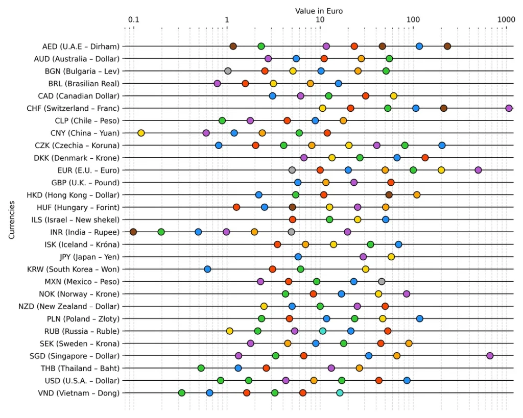
If you’re European, you’ve been conditioned to think purple equals expensive. High-value notes? Purple. Low-value notes? Anything but. So when a curious collector analyzed 30 of the world’s most common currencies to find a universal color hierarchy, the result was brilliantly, chaotically… nothing. No pattern. No logic. Just 157 currencies doing their own thing, like a global paint-shop explosion with zero coordination.
• 30 currencies analyzed (latest series only, aligned by EUR value)
• Most common color: Green (23%), followed by yellow (18%), grey (17%)
• Purple’s global share: A measly 10%—so much for “universal luxury”
• No clear value-to-color rule—blue, green, and red dominate across all denominations
The Great Color Myth: Why Your Wallet Isn’t Following Rules
Spoiler: blue, green, and red run the show—and nobody asked purple for permission.
The Reddit analysis pulled data from central bank websites, matched colors to denominations, and aligned everything by euro conversion rates. The hypothesis? Maybe there’s a global color code—purple for premium notes, yellow for pocket change. The reality? Green dominates (hello, US dollar greenback legacy), blue and red tie for second, and purple barely shows up unless you’ve got a stacked denomination ladder like India or Russia.
• National identity: Countries use color to assert currency branding (US “greenback” for 150 years)
• Visual hierarchy: Distinct colors prevent mix-ups (Swiss 20 CHF vs 100 CHF blue confusion fixed with yellows and blues)
• Anti-counterfeiting: Vibrant, multi-hue designs make forgery harder
The Euro itself is a case study: grey (€5), red (€10), blue (€20), orange (€50), green (€100), yellow-brown (€200), and the discontinued purple €500. Meanwhile, the Canadian $10 (purple-ish with rainbow holograms) won Banknote of the Year in 2018, beating Switzerland, Norway, and Russia—all because color and tech create appeal.
Global Color Frequency: Who Wins the Paint War
Green, yellow, and grey rule—purple barely makes the podium.
| Color | Global Share (%) | Example Currencies |
|---|---|---|
| Green | 23% | US Dollar (USD), Swedish Krona (SEK), Uruguayan Peso (UYU) |
| Yellow | 18% | Swiss Franc 10 CHF, Euro €200, Australian Dollar lower denominations |
| Grey | 17% | Euro €5, British Pound variants, Singapore Dollar (SGD) |
| Blue | 14% | Euro €20, Swiss Franc 100 CHF (formerly confused with 20 CHF blue) |
| Purple | 10% | Euro €500 (discontinued 2019), British £20 (violet), Indian Rupee high denominations |
| Red / Orange / Brown | <10% each | Euro €10 (red), €50 (orange); Canadian $50 (red), Russian Ruble 5000 (orange-red) |
Data sourced from Money.co.uk global currency study analyzing £20-equivalent notes or most-circulated denominations. Pantone matching via Color Thief software.
Why Color Actually Matters (Even Without a Code)
It’s not about rules—it’s about not mixing up your rent money with lunch cash.
Visual Hierarchy
Research confirms: size > color > design for quick recognition. The Swiss fixed their blue-note chaos (20 vs 100 CHF) by going yellow for the 10 and keeping blue distinct for 100. Distinct colors = fewer ATM errors.
Anti-Counterfeiting
Vibrant, multi-tone palettes (like Canada’s rainbow hologram $10) defeat color copiers. The IMF recommends six-color wheel logic: high denominations (red, purple), low denominations (orange, yellow, green, blue).
Cultural Trust
The US greenback’s 150-year green streak = global brand recognition. Changing it would destabilize economies using USD as reserve currency. Color = identity, and identity = trust.
Accessibility
Color-blind users (8% of men) rely on size + texture, not just hue. Euro notes pair color with tactile marks; Canadian notes add braille.
Beyond Color: What Denomination Gaps Tell Us
The Reddit chart revealed more than colors—it showed which countries trust high-value notes (and which don’t).
When the data aligned banknotes by EUR equivalent value, fascinating patterns emerged. Singapore’s retired SGD 10,000 note (~€6,800) was an outlier—so extreme it broke the chart scale. India discontinued its ₹2,000 note (included in the study despite non-circulation) because high denominations = money-laundering risk. Meanwhile, the Euro’s €500 (purple, discontinued 2019) met the same fate: “widespread illegal use”.
The chart also exposes purchasing-power quirks: a Danish 1,000 kr note (~€134) sits near a Swiss 100 CHF (~€105)—but Denmark uses it daily, while Switzerland’s 1,000 CHF (~€1,050) is a near-mythical beast for serious transactions.
FAQ — Banknote Colors Around the World
Is there a universal color code for banknote values?
No. Analysis of 30 currencies (157 notes total) found no global pattern. Green (23%) is most common, but appears across all value tiers.
Why is purple associated with high-value notes in Europe?
The Euro’s €500 (purple, discontinued 2019) and UK’s £20 (violet) created that association. Globally, purple accounts for only 10% of banknotes.
Which color is most common worldwide?
Green (23%), driven by the US dollar’s “greenback” legacy and currencies like the Swedish Krona and Uruguayan Peso.
Do colors help prevent counterfeiting?
Yes. Multi-hue designs with optically variable inks (like Canada’s rainbow hologram) defeat color copiers. The IMF recommends pairing distinct colors with UV/IR features.
Why did the €500 note disappear?
The European Central Bank stopped printing it in 2019 due to money-laundering and terrorism financing concerns. Existing notes remain legal tender indefinitely.
What features matter more than color for recognition?
Size > color > design, per cognitive research. Tactile cues (raised intaglio, braille) assist visually impaired and color-blind users.
Sources & References
- Reddit r/Banknotes — Original color analysis chart (30 currencies, EUR-aligned)
- It’s Nice That — Pantone study of global banknote colors (Money.co.uk)
- ImJustCreative — Colour of Currency: Pantone guide breakdown
- Colour Studies — Evolution of vibrant banknote design
- UBS — Swiss banknote color evolution (Roger Pfund interview)
- NIH/PMC — Cognitive study: size > color > design for banknote value recognition
- European Central Bank — Euro banknote design elements & color scheme
- Wikipedia — €500 note history & discontinuation (2019)
- IMF — The Design and Printing of Bank Notes (color-wheel strategy)
- Investasian — Highest value banknotes (Singapore SGD 10,000, India ₹2,000)
Color perception can be subjective; some currencies (e.g., RUB 1000 vs 2000) use cyan/orange distinctions visible only to trained eyes. Always verify against central bank imagery.
Discover our Shop Globenote: collectible and authentic banknotes from around the world